
How to Harmonize Colors for Interior Flow: A Step-by-Step Guide
- karmon28
- Aug 31, 2024
- 2 min read
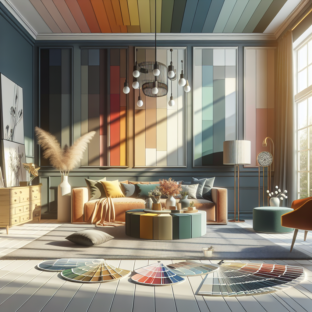
In the realm of interior design, colors play a pivotal role in setting the ambiance and creating a harmonious flow within a space. The right color palette can transform a room from ordinary to extraordinary, evoking emotions and enhancing the overall aesthetics. If you've ever struggled with choosing the perfect colors for your living space, fret not! This guide will walk you through the process of harmonizing colors to achieve a cohesive and visually appealing interior decor.
Step 1: Understanding Color Theory
Before diving into the world of color harmonization, it's essential to grasp the basics of color theory. Colors are classified into three primary categories: primary colors (red, blue, yellow), secondary colors (green, orange, purple), and tertiary colors (a mix of primary and secondary colors). Understanding how colors interact and complement each other is the key to creating a well-balanced color scheme.
Step 2: Choose a Dominant Color
The first step in harmonizing colors is selecting a dominant color that will serve as the foundation for your color palette. This color will be the most prevalent in your space, setting the overall tone and mood. Consider choosing a color that resonates with your personal style and the vibe you want to achieve in the room.
Step 3: Establish a Color Scheme
Once you've chosen a dominant color, it's time to build a color scheme around it. There are several popular color schemes you can opt for, such as complementary (using colors opposite each other on the color wheel), analogous (selecting colors next to each other on the color wheel), or monochromatic (utilizing variations of a single color). Experiment with different combinations to find the one that best suits your space.
Step 4: Consider the 60-30-10 Rule
To maintain balance and harmony in your color palette, follow the 60-30-10 rule. Allocate 60% of the room to the dominant color, 30% to a secondary color that complements the dominant hue, and the remaining 10% to an accent color that adds visual interest and pop to the space. This rule ensures a proportionate distribution of colors, creating a cohesive look.
Step 5: Test Before Painting
Before committing to a specific color scheme, it's advisable to test the colors in the actual space. Paint swatches on the walls or use color visualization tools to see how the colors interact with the lighting and decor elements in the room. This step will help you make an informed decision and avoid any color mishaps.
Step 6: Incorporate Texture and Patterns
Adding texture and patterns to your decor can enhance the visual appeal of the space and complement your chosen color scheme. Mix different textures like smooth, rough, shiny, and matte finishes to add depth and dimension. Introduce patterns through rugs, pillows, curtains, or artwork to create visual interest and balance the color palette.
Following these steps and guidelines, you can achieve a harmonious color scheme that seamlessly ties together your interior decor. Remember, there are no strict rules regarding color harmonization – trust your instincts, experiment with different combinations, and most importantly, have fun creating a space that reflects your personality and style.
Contact Karmon Baker Interiors in Greenville, SC for your color questions.

Comments